
Measuring error prevention means tracking how systems stop mistakes before they reach users.
If you want fewer defects, safer outcomes, and faster delivery, you need to measure how well you prevent errors, not just how fast you fix them. In this guide, I unpack Measuring Error Prevention from the ground up. You will learn simple ways to define it, track it, and improve it with data. I will share what worked for my teams, what did not, and how to build trust in your numbers.

What Measuring Error Prevention Means And Why It Matters
Measuring Error Prevention is the practice of tracking signals that show how well your system stops mistakes before they cause harm. It blends process science, human factors, and quality methods. The goal is to catch weak spots early and remove them for good.
Most teams count defects after the fact. That helps, but it is late. Measuring Error Prevention shifts focus to causes and shields. You measure near misses, controls in place, and checks that work. When you do this well, you cut risk, waste, and stress at the same time.
I first used these ideas in a busy support team. We were drowning in rework. Once we started Measuring Error Prevention, our calls dropped 30 percent, and morale rose. We saw patterns and fixed the root causes, not the symptoms.

Core Metrics For Measuring Error Prevention
You need both leading and lagging metrics. Leading ones show if your shields are strong. Lagging ones show if harm escaped. Use a small set and make the math clear to all.
Here are core measures for Measuring Error Prevention:
- Escape rate: Share of total errors found by users or in late stages.
- First pass yield: Share of work that flows end to end with no fix.
- Near miss rate: Count of caught errors per unit of work or time.
- Check compliance: Share of steps with proof of check (with time stamp).
- Poka‑yoke coverage: Share of risky steps with mistake‑proofing in place.
- Defects per unit or million: Simple rate to compare lines or apps.
- Change failure rate: Share of changes that cause rollback or hotfix.
- Time to detection: Time from cause to catch. Lower is better.
Build a prevention scorecard. Pair a leading and lagging metric for each high‑risk step. This creates balance and avoids blind spots. For example, pair near miss rate with escape rate.
Collecting Reliable Data Without Slowing Work
Good data should fit the flow. Do not ask people to fill long forms. Capture signals from tools and systems. Fill gaps with light samples.
Use these sources to support Measuring Error Prevention:
- System logs show alerts, blocks, and retries.
- Checklists store check marks and time stamps.
- CI pipelines record test runs and fails.
- Sensors track torque, temp, or seal in factories.
- EHR or CRM systems track overrides and near misses.
Use simple study designs. Start with a baseline week. Try a change on one team. Compare pre and post. Use A/B where you can. Watch trends, not one point. Add spot audits to fight underreporting. Keep privacy in mind and mask data that is not needed.
Methods That Drive Prevention
Tools matter when you can measure their effect. Each method below has a clear metric hook. That makes Measuring Error Prevention simple and fair.
Use these proven methods:
- Poka‑yoke: Design steps so a wrong action cannot pass. Track coverage and blocks.
- Checklists: Short, in the flow, with pause points. Track use and misses found.
- Standard work: Clear, visual steps. Track drift and updates.
- Automation: Unit, integration, and smoke tests. Track test gap and fail trends.
- Peer review: Fast checks for high‑risk work. Track defect density per review.
- SPC control charts: Spot drift and noise. Track signals breached.
- FMEA: Rank failure modes by risk. Track mitigations closed.
- Alerts with hold: Stop the line for safety. Track stops and escape rate after.
In my last product launch, simple checklists did most of the work. But a small poka‑yoke caught the big one. We added a field rule that blocked wrong IDs. Escape rate fell to near zero in a week.

Leading And Lagging Indicators
Leading indicators tell you if the shield is ready. Lagging indicators tell you if harm slipped through. You need both for Measuring Error Prevention.
Pair examples:
- Checklist use rate with escape rate.
- Near miss rate with incident rate.
- Test coverage with change failure rate.
- Poka‑yoke coverage with defect per unit.
Do not chase one number. Watch the set move as a system. If near misses drop but escapes rise, people may be afraid to report. If checks rise but escapes do not fall, checks may be weak or rushed.

Dashboards And Reporting That Teams Use
A good dashboard is simple. It shows the vital few numbers and the trend. It helps teams act this week. It supports leaders with one view across units.
Build your dashboard for Measuring Error Prevention with:
- A metric tree that links actions to outcomes.
- Run charts with control limits for key rates.
- Red and green bands set by risk, not by desire.
- Drill downs by product, shift, or change set.
- Notes for learnings and fixes tried.
Set a weekly rhythm. Review the same time, same place. Pick one change to try. Log what you learn. Over time, this steady beat drives big gains.
Industry Examples And Benchmarks
Measuring Error Prevention looks a bit different by field. The core idea stays the same. Stop harm upstream and prove it with data.
Software and DevOps:
- Track bug leakage, change failure rate, and mean time to restore.
- Add pre‑merge tests, linters, typed APIs, and feature flags.
- One team I coached cut escape rate from 12 percent to 3 percent in two sprints.
Healthcare:
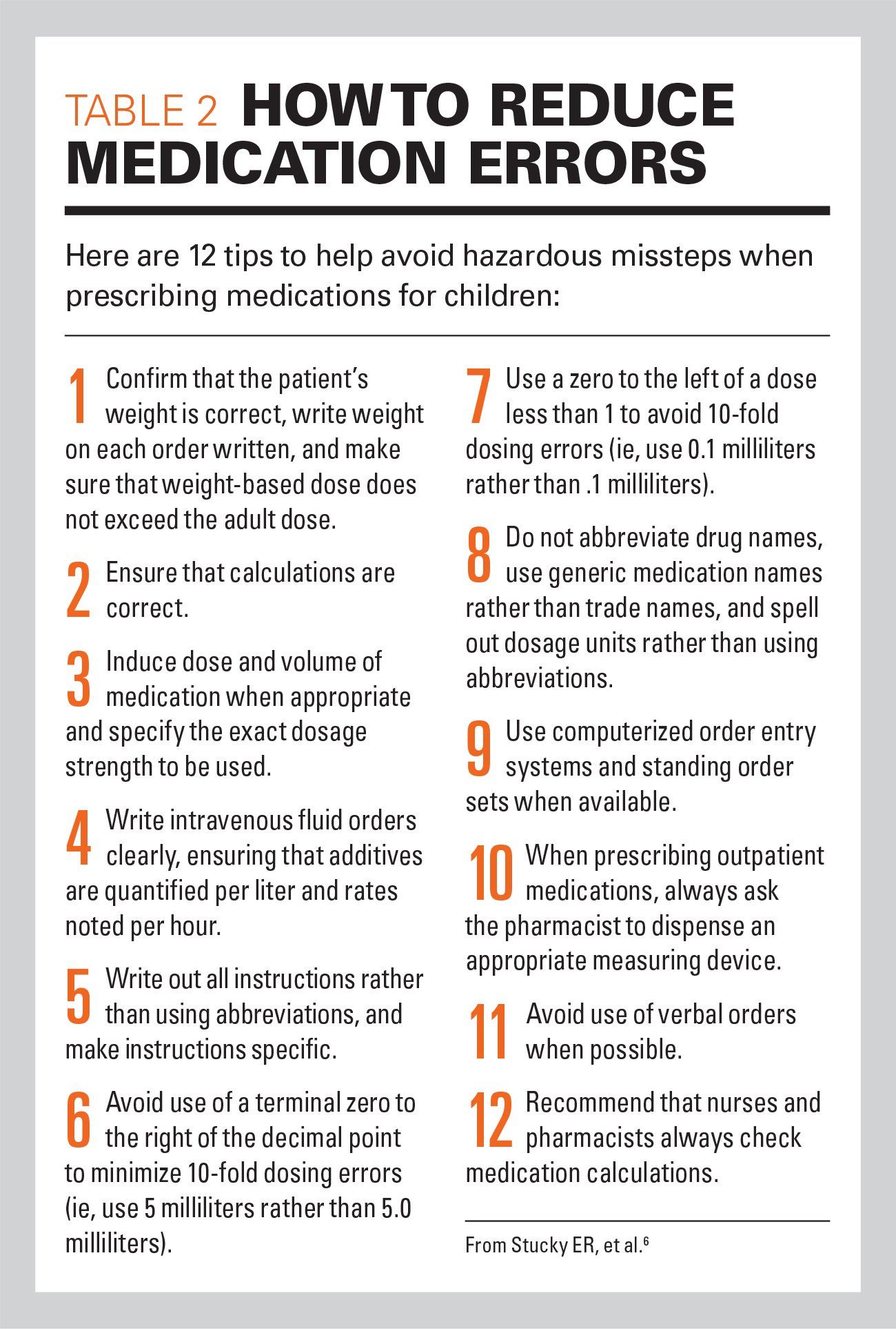
- Track near misses with meds, barcode scan rate, and wrong‑site blocks.
- Use time‑out checklists and smart pumps.
- A unit I advised raised scan compliance to 98 percent and cut events by half.
Manufacturing:
- Track first pass yield, parts per million, and Andon stops.
- Add torque sensors and gauge repeat checks.
- A plant I worked with lifted FPY from 87 percent to 95 percent in one quarter.
Finance and Ops:
- Track recon breaks, straight‑through rate, and approval overrides.
- Add dual controls and data validation rules.
- One desk saw 40 percent fewer breaks after rule tuning.
Use benchmarks with care. Your mix of risk and work is unique. Use your baseline as your yardstick.
Step‑By‑Step Implementation Roadmap
Here is a clear path to start Measuring Error Prevention and make it stick.
- Map the risk. List the steps where a miss hurts most.
- Pick two or three metrics per step. One leading, one lagging.
- Define each metric in one line. Scope, source, and owner.
- Instrument the flow. Add logs, check marks, and flags.
- Capture a clean baseline. Do not skip this.
- Pilot on one team. Keep the rest as a control if you can.
- Review weekly. Try one change. Note the learning.
- Scale what works. Drop what adds effort with no gain.
- Bake it in. Make dashboards and reviews part of the job.
- Keep it humane. Praise near miss reports. Never punish honesty.
This plan is small on paper and big in effect. Take it step by step.
Common Pitfalls, Biases, And How To Avoid Them
Measuring Error Prevention can go wrong if you do not watch for traps. Here are the big ones I see.
- Goodhart’s law: When a number becomes a goal, people game it. Use sets of metrics and rotate audits.
- Underreporting: People fear blame. Make near misses a badge of care, not a mark of shame.
- Vanity metrics: Big numbers that mean little. Tie every metric to a clear action.
- Sample bias: Only logging day shift or clean cases. Randomize and spot check.
- Metric drift: Definitions change over time. Lock terms and version your playbook.
- Context loss: Rates hide volume and mix changes. Show both counts and rates.
One shop I met hid near misses for years. We flipped the script. We praised finds in standups. Reports rose fivefold. Escapes fell. Trust grew.
Proving ROI Of Measuring Error Prevention
Leaders want to see the dollars. You can show it with simple math. List the cost of poor quality. Add labor, refunds, fines, and lost sales. Show the drop after changes.
Ways to show ROI:
- Cost per incident times incidents avoided.
- Hours of rework saved times loaded rate.
- Risk reduction for top hazards with expected loss math.
- Premiums or ratings tied to safety scores.
On one platform, a one‑line input rule saved us about 1,000 tickets a year. At 20 minutes each, that was 333 hours. At a $60 rate, that is $20,000, plus less churn. The rule took one day to ship.
Advanced Topics And Trends
Measuring Error Prevention keeps growing. New tools and ideas can help.
Trends to watch:
- AI and anomaly detection that watch for drift and odd patterns.
- Process mining to see real flows and hidden waits.
- Human factors and Safety‑II, which study what goes right.
- Digital twins to test changes before you touch the line.
- Fairness and ethics checks to prevent harm to groups.
Use these with care. Start simple. Add new tech when the basics run well.
Frequently Asked Questions of Measuring Error Prevention
What is the first metric I should track?
Start with escape rate for your highest risk output. Then add one clear leading metric that you can act on each week.
How often should we review prevention metrics?
Weekly is best for teams. Monthly is fine for exec views, but keep the team loop short so you can learn fast.
Are checklists enough to prevent errors?
Checklists help, but they are not magic. Pair them with automation, training, and mistake‑proofing to get strong results.
How do we avoid underreporting near misses?
Build a safe culture and praise finds. Keep reports short, easy, and focused on learning, not blame.
How long until we see results?
You can see early wins in two to four weeks. Lasting change takes a few cycles of test, learn, and scale.
What tools do we need to start?
Use what you have first. Logs, simple forms, and a shared dashboard will do for the first pass.
Conclusion
Measuring Error Prevention shifts your team from fire drills to calm, steady flow. You learn where harm starts and you stop it early. You cut cost, boost trust, and make work feel sane.
Pick one process. Define one escape metric and one prevention metric. Instrument, baseline, and review weekly. In a month, you will see the curve bend. Want more guides like this? Subscribe, share your wins, or ask a question in the comments.